In my experience, the relationship that human beings have with vacations is deeply irrational. On the one hand, we visit destinations that are wildly popular, and on the other, we trick ourselves into believing that our vacations are completely unique. The end result of this mental lapse in judgment is that we perceive vacations as being luxury goods that we can show off to our friends about even though the travel packages that we buy are highly replicable. This poses travel marketers with a unique hurdle to overcome in the lead generation process.
You must somehow shroud the reality of the commodified packages that you sell in a mist of luxury.
Traditional Landing Pages are terrible at this. Listing pages offer prospects choice but play right into the commodified nature of travel packages. Custom package landing pages are a step above but only marginally so. They hide the array of packages available behind a lead capture form and give prospects the feeling of true customization, but the impersonality of the lead capture form itself undercuts the feeling of luxury that prospects crave. The end result is a Conversational Landing Pages solve this problem. They transform the lead generation experience into a conversation, and in the process create a guided buying experience that converts. This guide is the ultimate cheat sheet to help you leverage the technology for your marketing campaigns. By the end of it, you will be prepared to create your own conversational landing page and give your prospects the lead generation experience that they want.
Check out the Destination Europe and Beyond Conversational Landing page: http://bit.ly/2GSwNm7
And the Destination Europe and Beyond Traditional Landing Page: http://bit.ly/2IWgFDI
Landing Page Assessment
Custom package landing pages typify a paradox that is common in the travel marketing space. On the one hand, they promise luxurious trips to far off places and on the other, they capture lead information in a mundane, soul-crushing manner that is sure to cause prospects to drop.
In the landing page above, for example, prospects are confronted with a barrage of never-ending form fields that make the buyer experience feel a lot more like an auto insurance quotation process than the start of a potentially amazing vacation.
To make matters worse, some of the fields in the form are woefully cryptic. For example, no matter how I tried, I could not de-code what was being asked of me in the transportation info section of this form.
In our conversational landing page, we will address this shortfall by transforming the exact same lead capture experience into a conversation that makes the process feel more engaging.
Creating the Landing Page
Building the Conversational Landing Page
We like to split the creation process for a pure lead generation conversational landing page into three distinct stages: the hook, lead generation, and design. Each stage requires a separate set of considerations that we have detailed below
The Hook
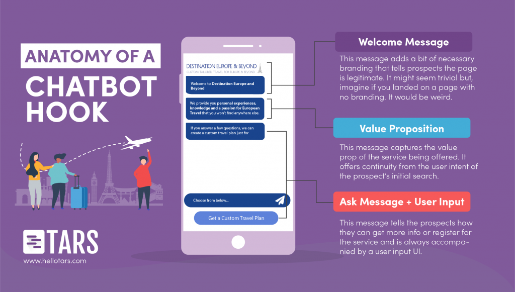
The vast majority of people who drop from a page, drop within the first 7 seconds. This means that optimizations right at the beginning of your conversational flow are the most crucial way of improving your conversion rate. This is where the hook comes into play. The hook is a series of three messages and a user input that establishes the legitimacy of the page (welcome message), captures user attention (value proposition message) and shepherds prospects into the lead generation process (ask message + user input).

So how can you optimize these messages? Here are a few key optimizations that you should never forget:
- Use a logo in your welcome message. People take it for granted that a landing page will have a logo on it, but when it’s missing it is eerily obvious. Landing pages without logos look generic, and generic landing pages run the risk of looking spammy. It should go without saying that spammy landing pages don’t convert, so please add a logo in your welcome message.
- Keep your messages short- Your prospects don’t want to read an essay so don’t cram as much info into a message as possible. We recommend restricting your messages to the length of a short tweet.
- Don’t send more than three messages- Having 15+ short messages is just as bad as having 3 long messages. Use your discretion to figure out what feels most natural but in the hook we recommend 3 at max.
- Make your ask uncontroversial- Make an ask that isn’t too personal and can be responded to without any real repercussions for the prospect. For example, in this conversational landing page I asked if prospects to Get a FREE Quote. Pressing this button doesn’t share any personal info and if prospects don’t like what they see on the other side they can close. But, once they click, they will feel more invested and might actually convert. As an added advantage, uncontroversial asks can be responded to with a button, which is easier than tapping out a whole name or zip code.
Lead Generation Experience
Once you’ve begun the conversation, lead capture becomes easier, but you aren’t out of the woods yet. Asking for information through a chat is very different from asking for the same information through a form. Forms are impersonal by nature, meaning that it is socially acceptable for you to say First Name and then a blank field or zip code and then a blank field. In a chat, on the other hand, you are bound by human etiquette. You must be polite and you must provide good customer service. There are three simple best practices that you can implement to achieve this:
Ask full questions
Saying “Name?” or “Name:” in a message is abrupt. It comes across as casual at best and rude at worst. Instead, go that extra mile and phrase the message as a full question like “What is your name?”
Acknowledge user input
If a prospect sends you a piece of information, acknowledge it (even if you just say “great”) and, if required, inform them of what’s to come (something like “I need a few details to get you set up”). If you don’t include spacers like this, your conversation will feel more like an interrogation than a customer service experience.
Order your questions right
This comes back to the emphasis on politeness in conversational design. Certain ways of ordering questions can feel rude, and you want to avoid them at all costs. The two most obvious ways of doing so are to ask for the name first, because, in real human conversations, you always like to know who you are speaking to.
And to reserve contact detail questions to the end for the end, because an early ask for these details can be perceived as “sales-y.”
Design
Conversational landing pages use text to convert prospects but this doesn’t mean you should neglect the visual aesthetic of your page. The default chat design on TARS is the generic blue and gray color palette of Messenger and iMessage. Unless your travel agency has the same brand colors, your page will look super generic if you don’t change it. As I mentioned earlier, generic pages look spammy and spammy pages don’t convert. We recommend making the bot messages your primary brand color and the user messages your secondary brand color, or if you have just one color, make both types of messages that color.

Arnav is the Director of Content Marketing at Tars. He spends most days building bots, writing about conversational design and scrolling through Giphy’s trending section looking for the gifs that go into the Tars Newsletter.

0 Comments on "[Designing Conversations] How to make a Conversational Landing Page for a Travel Marketing Campaign"